Practical surface design for UBC, Commercial Drive, and Granville & 41st: crosswalks, wayfinding, and plazas that build district identity in durable preformed thermoplastic.
Great neighbourhoods feel intentional. Their crosswalks invite you in and their colours tell a story. In Vancouver's commercial districts and at its university entrances, decorative crosswalk design is one of the strongest tools for shaping how a place feels.
The systems
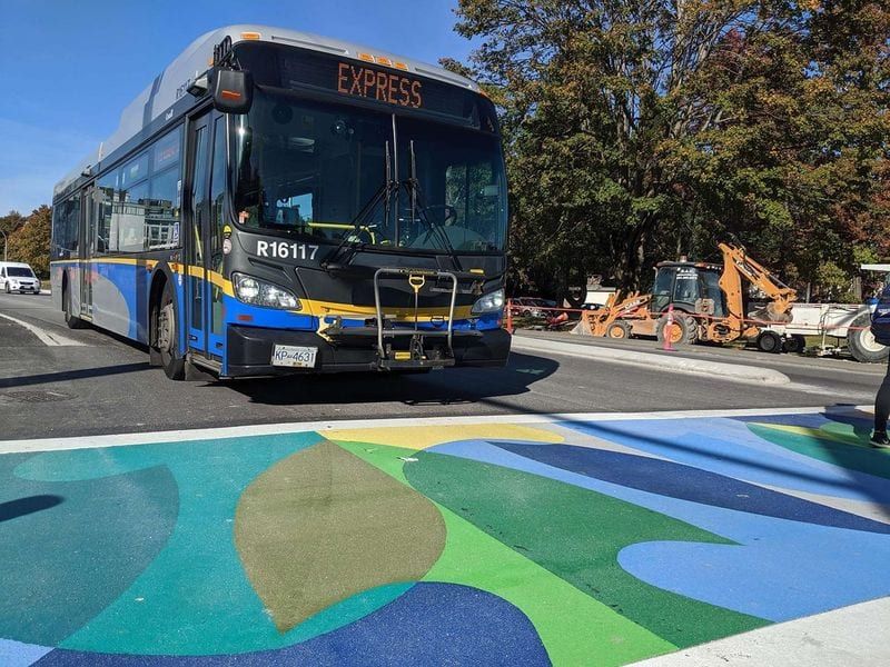
TrafficPatternsXD heavy-duty textured surfacing suits high-wear trail crossings and multi-use path intersections along the Pacific Spirit Trail and North Vancouver's active-mobility network. Its thick, aggregate-reinforced structure stands up to braking, turning, and frequent foot, wheel, and bus traffic, while the textured profile enhances traction in the region's year-round wet conditions.
TrafficPatternsXD holds its colour, slip resistance and visibility through repeated winters, at trailheads, road-to-trail transitions and routes with steady commuter cycling.
Application sweet spots:
- District entry points requiring immediate visual impact
- Transit station forecourts
- Heritage zones balancing authenticity with accessibility
- University campus perimeters
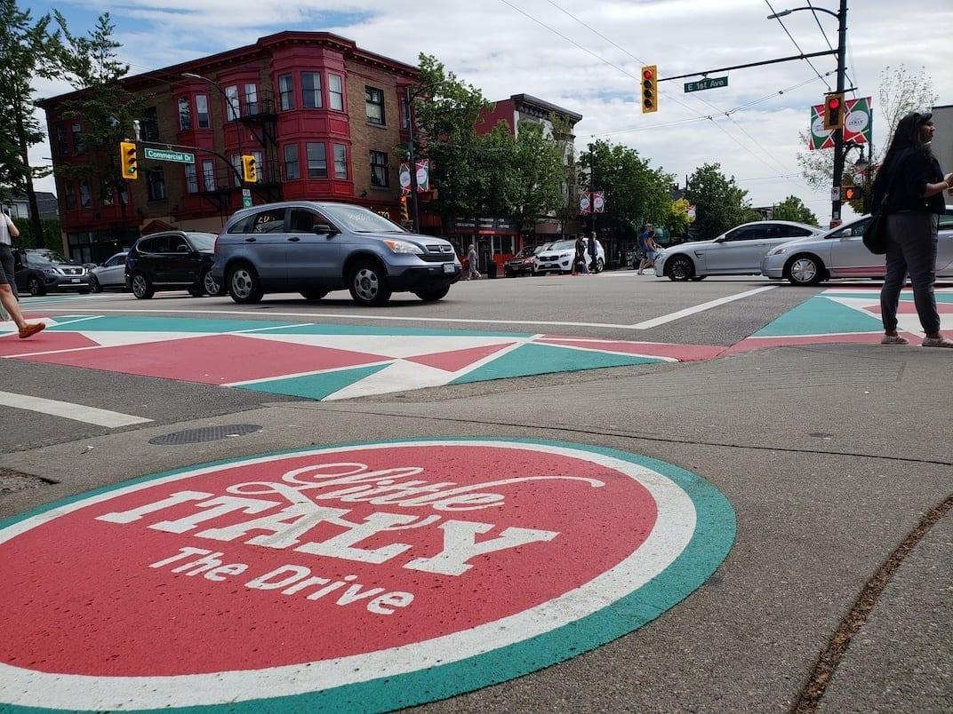
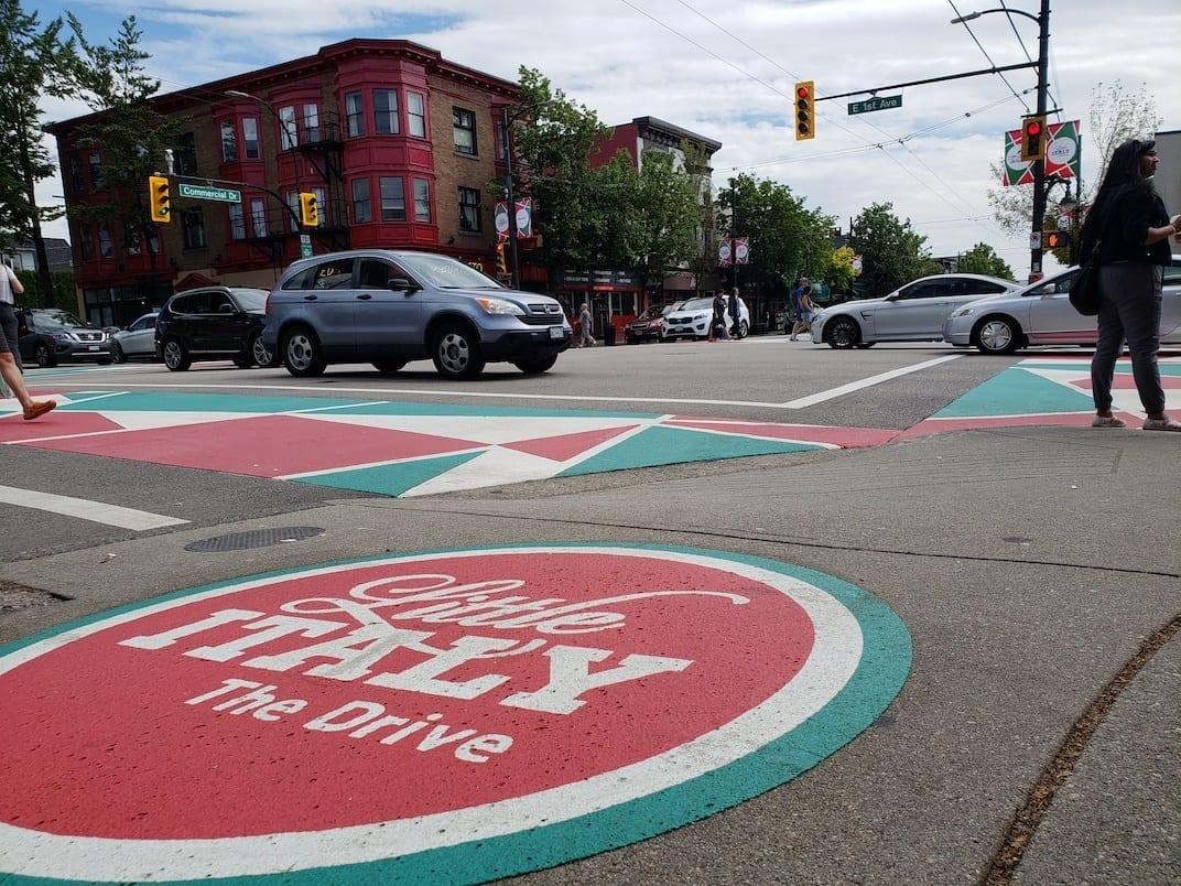
Commercial Drive: Little Italy crosswalk intersections
Commercial Drive sits at the cultural heart of Little Italy, where pedestrian activity, patios, transit, and independent businesses all converge. Crosswalks here should reinforce the neighbourhood's Italian identity while remaining durable enough for year-round bus traffic, turning movements, and high pedestrian volumes.
The combination of TrafficPatternsXD and DecoMark gives an expressive, long-lasting treatment.
Recommended surface package: TrafficPatternsXD and DecoMark
Primary Crossings (All Legs):
Use TrafficPatternsXD heavy-duty textured preformed thermoplastic for every crosswalk along Commercial Drive:
- The aggregate-reinforced structure withstands buses, scrubbing, braking, and tight turning movements
- The textured profile enhances traction in Vancouver's frequent wet conditions
- Colours remain vibrant for years, giving the Little Italy identity a consistent presence throughout the corridor
Choose warm red, deep green, or terracotta-inspired tones that echo the cultural palette associated with Italian heritage districts.
Cultural branding (DecoMark district identity):
Place DecoMark precut preformed thermoplastic district logos at key nodes: crosswalk thresholds, block gateways, and plazas or patio entry points. These graphics keep crisp edges under heavy foot traffic, which suits long-term branding on the street surface.
Spec Notes:
- Require full-scale colour and pattern mock-ups for approval
- Keep crossing patterns simple, geometric, and readable at driver approach speeds
- Place culturally specific graphics using DecoMark, not inside the crosswalk field
- Include a spring post-winter inspection (quick repairs via individual replacement sheets)
- Maintain consistent colour palette across all crossings to reinforce corridor identity
UBC campus gateway crosswalks
UBC's campus gateways carry a unique mix of heavy pedestrian volumes, cycling flows, bus activity, and service vehicles. Crosswalks here should feel unmistakably "UBC": highly visible, consistent across multiple entrances, and engineered to withstand year-round coastal weather.
Recommended package: TrafficPatterns
Primary Crossings (Campus Entrances):
TrafficPatterns decorative preformed thermoplastic delivers crisp, high-contrast crosswalks that remain visible through rain, overcast light, and frequent campus traffic. Heat-applied, it bonds to the asphalt and keeps its slip resistance, critical in wet Vancouver conditions.
Campus Identity & Wayfinding:
TrafficPatterns can carry the campus colours and vary the pattern from one entrance to the next. For precise crests, directional arrows, or orientation symbols, pair with DecoMark for sharper graphic definition.
Spec Notes:
- Require full-scale colour and layout mock-ups for campus review and accessibility verification
- Keep tactile surfaces untouched; locate decorative panels adjacent, not overlapping
- Align panel seams with drainage direction to prevent ponding on high-use entrances
- Include a post-winter check for edge scuffing in transit-heavy legs
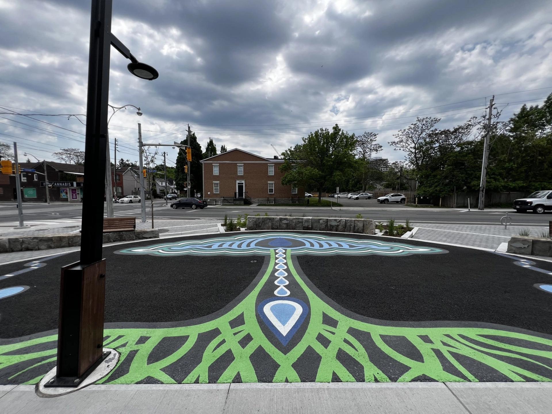
An Indigenous-inspired crosswalk concept for Granville & 68th
A high-visibility crosswalk with a plow-friendly surface.
Recommended package: TrafficPatterns and DecoMark
Crosswalk field (primary):
Use TrafficPatterns decorative preformed thermoplastic for a bold, stable colour field that supports Indigenous-inspired geometry. Heat-applied, it bonds to the pavement and resists wear, keeps its edges crisp and stays visible through Vancouver's wet and winter seasons.
Cultural geometry blocks:
TrafficPatterns takes modular pattern inserts that can reflect Indigenous symbolism in an abstract, respectful way, readable at driver approach distances.
Wayfinding & iconography:
For sharp, culturally significant symbols (e.g., animal motifs, territory marks), pair TrafficPatterns with DecoMark precut graphics at thresholds where people pause, not mid-crossing, so the symbols stay legible and are treated with respect.
Engagement Note:
For Indigenous-inspired patterns or symbols, conduct co-design with the relevant Nation(s), confirm artwork usage approvals, and establish expectations around long-term stewardship and future refresh cycles.
Contact HUB Surface Systems to request a design consultation or book a Lunch & Learn for your landscape architecture or municipal planning team.